Lorenz curve and Gini Coefficient are classic indicators in the field of economics. The Lorenz curve and Gini coefficient are important tools for professionals who work with data related to income inequality and wealth distribution, as well as for those who need to understand economic and social trends in their respective fields.
We’re about to uncover some vital information. Let’s start.
Lorenz curve
The Lorenz curve is a graphical tool that is widely used to characterize the concentration of a measure in a population, such as wealth.
Consider a case of data analysis where we have household income data i.e. households and their income. We collected a list of all household incomes in the economy in order from low to high
Plotting points on a graph–
Along the x-axis, we measure the Cumulative Percent of Households.
Along the y-axis, we measure the Cumulative Percent of Wealth.
After plotting all the points, you will have the Lorenz curve
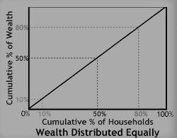
The Lorenz curve for a completely even income distribution (every family has the same income) would lie on the diagonal (as shown below). If all households have the same income, the Lorenz curve is a straight diagonal line, called the line of equality.

In the above figure, the Lorenz curve is a diagonal line at 45 degrees i.e. 10 % of the households have 10% of the wealth, 50 % of the households have 50% of the wealth, 80 % of the households have 80% of the wealth, and so on.
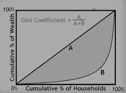
If there is any inequality in size, then the Lorenz curve falls below the line of equality (shown below).

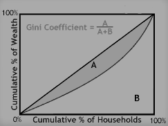
Consider another case of inequality (shown below), the degree of inequality is lesser here.

Gini coefficient
The Gini coefficient is a numerical measure of inequality based on the Lorenz curve.
Curve B, is the Lorenz curve (this is a case of income inequality), and it lies below the line of equality (Curve A).
In the above two figures, you can spot the formula of the Gini-coefficient, A & B denote area as described below:
The Gini Coefficient for a Lorenz curve is defined as the ratio of the area between the Lorenz curve and the diagonal to the triangle below the diagonal line. In the graph above, the area between the Lorenz curve and the diagonal is shown in grey. The area of the triangle is shown as the area of the lower triangle formed by the line of equality.
The Gini coefficient is then a number that falls in the range from 0 to 1.
For a completely equal income distribution, the area is zero and the Gini coefficient is zero.
For the completely concentrated distribution, the area is the same as the triangle so the Gini coefficient is one (If all of the income was received by one family the Lorenz would be a zero for every point on the horizontal axis except 100% where it would jump to 100% on the vertical axis. This would be the case of complete concentration of the income distribution and would represent complete income inequality).
Gini should not be mistaken for an absolute measurement of income or wealth. A high-income country and a low-income one can have the same Gini coefficient, as long as incomes are distributed similarly within each country.
Frequently Asked Questions
How is Lorenz curve related to Gini coefficient?
The Lorenz curve is a graphical representation of income or wealth distribution, while the Gini coefficient is a numerical measure of income or wealth inequality derived from the Lorenz curve. Put simply, the Lorenz curve provides a visual representation of income or wealth distribution, and the Gini coefficient provides a single number to measure the level of income or wealth inequality.
What is the formula for the Gini coefficient?
The formula for the Gini coefficient is as follows:
G = (A / (A + B))
Where:
G: Gini coefficient
A: Area between the Lorenz curve and the line of perfect equality
B: Area under the line of perfect equality
The resulting value ranges from 0 (perfect equality) to 1 (perfect inequality).
What is meant by Lorenz curve?
The Lorenz curve is a graphical representation of income or wealth distribution within a population, where the horizontal axis represents the cumulative percentage of the population ranked by income or wealth, and the vertical axis represents the cumulative percentage of income or wealth held by that percentage of the population. The Lorenz curve is a way to visually assess the distribution of income or wealth within a society and provides a basis for calculating the Gini coefficient.
What is 1 known as in Gini coefficient?
In the Gini coefficient, a value of 1 represents perfect inequality, where all the income or wealth is held by a single person or group, while a value of 0 represents perfect equality, where every person has an equal share of income or wealth.
What is Gini coefficient used for?
The Gini coefficient is used as a measure of income or wealth inequality within a society. It provides a single number that allows for comparisons between different populations or countries. The Gini coefficient is used by policymakers, economists, and researchers to identify trends and patterns in income or wealth distribution and to inform policy decisions aimed at reducing inequality.
What unit is Gini coefficient?
The Gini coefficient is a dimensionless value and does not have any specific unit. It is expressed as a number between 0 and 1, where 0 represents perfect equality (every person has an equal share of income or wealth) and 1 represents perfect inequality (all the income or wealth is held by a single person or group).
Difference between gini coefficient and lorenz curve
The Lorenz curve and Gini coefficient both measure income inequality, but in different ways. The Lorenz curve is a graph showing the distribution of income or wealth, while the Gini coefficient is a numerical measure ranging from 0 to 1. A score of 0 represents perfect equality, while 1 represents perfect inequality. The Gini coefficient is calculated by dividing the area between the Lorenz curve and the perfect equality line by the total area under the line.
Conclusion
For quantifying income or wealth disparity in an economy, the Lorenz curve and Gini coefficient are effective instruments.
While the Gini coefficient provides a single number that quantifies the degree of inequality, the Lorenz curve offers a visual representation of the distribution of income or wealth.
These measurements can assist decision-makers in determining the sectors of the economy where inequality is most pronounced and, if required, in developing policies to lessen it.
In general, the Lorenz curve and Gini coefficient are helpful tools for analyzing wealth or income inequality in an economy, but they should be used in conjunction with other indicators and methods to properly grasp the complexity of the problem.
I highly recommend checking out this incredibly informative and engaging professional certificate Training by Google on Coursera:
Google Advanced Data Analytics Professional Certificate
There are 7 Courses in this Professional Certificate that can also be taken separately.
- Foundations of Data Science: Approx. 21 hours to complete. SKILLS YOU WILL GAIN: Sharing Insights With Stakeholders, Effective Written Communication, Asking Effective Questions, Cross-Functional Team Dynamics, and Project Management.
- Get Started with Python: Approx. 25 hours to complete. SKILLS YOU WILL GAIN: Using Comments to Enhance Code Readability, Python Programming, Jupyter Notebook, Data Visualization (DataViz), and Coding.
- Go Beyond the Numbers: Translate Data into Insights: Approx. 28 hours to complete. SKILLS YOU WILL GAIN: Python Programming, Tableau Software, Data Visualization (DataViz), Effective Communication, and Exploratory Data Analysis.
- The Power of Statistics: Approx. 33 hours to complete. SKILLS YOU WILL GAIN: Statistical Analysis, Python Programming, Effective Communication, Statistical Hypothesis Testing, and Probability Distribution.
- Regression Analysis: Simplify Complex Data Relationships: Approx. 28 hours to complete. SKILLS YOU WILL GAIN: Predictive Modelling, Statistical Analysis, Python Programming, Effective Communication, and regression modeling.
- The Nuts and Bolts of Machine Learning: Approx. 33 hours to complete. SKILLS YOU WILL GAIN: Predictive Modelling, Machine Learning, Python Programming, Stack Overflow, and Effective Communication.
- Google Advanced Data Analytics Capstone: Approx. 9 hours to complete. SKILLS YOU WILL GAIN: Executive Summaries, Machine Learning, Python Programming, Technical Interview Preparation, and Data Analysis.
It could be the perfect way to take your skills to the next level! When it comes to investing, there’s no better investment than investing in yourself and your education. Don’t hesitate – go ahead and take the leap. The benefits of learning and self-improvement are immeasurable.
You may also like:
- What are quartiles, deciles and percentiles in statistics?
- Standard deviation and variance in statistics
- What is data distribution in machine learning?
- Skewness for a data distribution
- Kurtosis for a data distribution
- Interpretation of Covariance and Correlation
- Normalization vs Standardization
- What is hypothesis testing in data science?
- What do you mean by Weight of Evidence (WoE) and Information Value (IV)?
- Statistics Interview Questions 101
Thanks a ton for visiting this website. Curious about how product managers can utilize Bhagwad Gita’s principles to tackle difficulties? Give this super short book a shot. This will certainly support my work.
To learn more, here go the tables of contents on Product Management & Data Science.

